SaaS onboarding usability: test the first useful task, not the tour
- Product design
- SaaS development
- Usability

SaaS onboarding is usable when people can understand the task, complete it and recognize what happened. A clean screen can help, but it does not prove those outcomes. Teams need to see how likely users approach the work, including the assumptions they bring from other products.
An older interface-design essay resurfacing on Hacker News raises a useful question: how much of an interface feels obvious because its audience has already learned the pattern? For product teams, that question leads to a practical method. Define a real task, observe it without coaching and improve the places where the design asks users to guess.
An older discussion, not a new usability finding
The essay by RJK traces the uncertain attribution of a familiar interface aphorism through older discussions. The current HN submission labels it as a 2012 item and contains differing views about learned familiarity. Neither source is a controlled study of SaaS onboarding.
We use that resurfaced discussion as a prompt to examine what a team means by “intuitive.” The goal is not to resolve the quotation’s history or claim that every interaction is learned in the same way. It is to replace a vague design approval with evidence about a particular audience completing a particular task.
The framework below is Curiosive’s recommendation for product teams. Its examples are illustrative, not reports of customer research or conversion improvements.
Start with a task, not a tour
Choose the first useful outcome the product should help a new user achieve. Account creation is often only a prerequisite. A customer might need to invite a colleague, upload a document, create a booking or understand which records they can access.
Write the task in the user’s language. “Set up a place for your team to share these files” gives a person a goal. “Click Create Workspace in the upper right” tells them how to navigate and hides whether the interface makes that action discoverable.
Separate the user’s outcome from the product’s preferred sequence. If the onboarding flow requires configuration before anything useful is visible, identify why. Some information may be necessary for access or operation; some may be better collected when its purpose becomes clear.
Use a realistic starting point. A person arriving from an invitation has different context from someone who signed up after reading a marketing page. An existing employee may know the domain but not the product. A first-time customer may know neither. Those differences belong in the research plan.
Make unfamiliar decisions visible
Inspect the words the interface uses at each decision. A team can become fluent in its own labels while customers remain unsure whether “space,” “project” and “organization” refer to different things. Prefer labels that explain the intended action or object in the context of the task.
Make required information and its purpose clear before submission. W3C’s guidance on labels and instructions explains the need to identify expected input and provide relevant cues. It also distinguishes visible labels from accessible names and points to separate markup requirements. Adding an invisible label alone does not settle whether everyone can understand a form.
Use examples where a format or unfamiliar concept matters. Keep instructions near the relevant choice instead of hiding every explanation in a separate help center. Too much text can also obscure the action, so test whether the explanation resolves a real uncertainty.
For an illustrative team portal, a role selector should help an administrator understand what each role allows before inviting someone. Familiar-looking controls do not excuse ambiguous permission language. The interface needs to show the consequence of the choice the person is making.
Show progress and a meaningful result
A button press is not the end of a task. People need to know whether work is pending, completed or rejected. A file upload can finish transferring bytes while processing is still running. An invitation can be accepted by the application while email delivery remains a separate step.
Represent those states accurately. Do not display a final success message merely because the first request returned. If work takes time, explain what is happening and what the user can do next. Keep the amount of detail appropriate to the decision, rather than exposing implementation terminology.
Check the empty state after onboarding. A dashboard with no records can leave a new user wondering whether setup failed. Explain the next useful action and what will appear after it. If the person lacks permission to create the first item, show a route to the right owner rather than an action they cannot complete.
Returning users need a different experience from new users. Avoid making a tutorial the only way to find important functionality. The product should remain navigable after the introductory cues are dismissed.
Design the recovery path
Test what happens after incorrect input, an expired invitation, a slow response or an interrupted task. These states are part of the interface. A product that works only with ideal inputs can appear simple during a demonstration and confusing during normal use.
W3C’s error-identification guidance describes identifying the affected input and explaining an automatically detected error in text. For product design, that supports a concrete review question: can the person tell which part failed and what needs attention?
Preserve valid work when appropriate. A rejected field should not erase the other information a person already supplied without a clear reason. If retrying an action could create a duplicate record, the application needs a safe retry behavior as well as reassuring copy.
Distinguish a customer mistake from a service problem. “Something went wrong” offers little help for either. Give a useful explanation, a sensible next action and a support route when the user cannot resolve the issue alone. Avoid exposing private system details in the message.
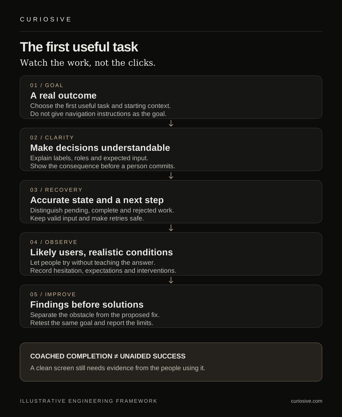
Observe likely users without teaching the answer
Moderated usability testing means observing people attempting tasks with the service. The GOV.UK Service Manual guide, published in 2017, recommends relevant tasks with clear goals that do not reveal the solution, and recruiting actual or likely users. It is established practical guidance, not a new 2026 research result.
For a focused onboarding study, state the research questions before recruiting. Do people understand the organization model? Can they complete the first useful action? Do they know what the final confirmation means? The questions should describe uncertainty the team can resolve with observation.
Let participants work before intervening. Record where they hesitate, what they expect and the language they use. If the moderator must help, note the intervention. A task completed after a hint should not be reported as an unaided success.
Use suitable data and access controls for the session. A prototype can use realistic fictional records; a live-product test needs an arrangement that protects participant information and prevents unintended operational actions. Explain any recording and retain only what supports the agreed research purpose.
Include the people and devices the product serves
The intended audience should influence both recruitment and test conditions. Someone using a keyboard, screen reader or magnification can encounter a different barrier from someone using a mouse on a large display. A mobile user may have less context visible when choosing between actions.
Manual accessibility checks and participant research answer related but different questions. A standards review can identify specific implementation problems. Observing a person can reveal whether they understand and complete the task in their own setup. A favorable session does not establish complete accessibility conformance.
For a multilingual product, review the task and the interface in the languages it actually supports. Translation can change label length and the meaning of domain terms. Do not assume an English onboarding result applies to another audience because the underlying screen structure is the same.
Use actual constraints where possible: a narrow viewport, realistic content length and the permissions of the intended role. Avoid testing every participant with an administrator account if the product is mainly used by people with restricted access.
Turn observations into decisions
Record the observed obstacle separately from the proposed fix. “The participant interpreted the role name as a billing plan” is evidence. “Replace the selector with cards” is a design option. Keeping them separate helps the team compare solutions instead of treating the first suggestion as the finding.
Prioritize by the consequence for the task and the strength of the evidence. An access-related misunderstanding may deserve attention before a cosmetic hesitation. Explain which audience and context were observed, and where a conclusion remains uncertain.
Retest the changed flow against the same goal. A clearer label may solve one problem while creating another distinction that people do not understand. Keep changes focused enough to identify what improved and what still needs work.
If the live product has appropriate analytics, use them to ask better questions. A drop-off can identify where to investigate, but it does not explain a person’s reasoning. Combine behavioral observation with product data without presenting a small qualitative study as a statistically established conversion lift.
A useful onboarding review brief
- Who is arriving, from where, and with what prior knowledge?
- What first useful outcome should they achieve?
- Which labels, permissions or prerequisites are likely to be unfamiliar?
- What happens during waiting, invalid input and interruption?
- Which evidence will distinguish unaided completion from coached completion?
The deliverable should include observed obstacles, proposed changes and the checks needed to assess them. It can recommend a smaller change than a visual redesign. Clear wording, accurate state and a recoverable form may address the actual barrier more directly.
Make the first useful task clear
Planning a SaaS product or improving an existing onboarding flow? Explore Curiosive’s SaaS development services and our product engineering approach, or tell us who uses the product and which task is causing friction.
Bring a representative workflow, the intended audience and any evidence already collected. That gives the team a concrete problem to discuss instead of asking whether a screen feels intuitive to its designers.
Sources and scope
Read on 3 October 2026: RJK’s historical essay, the HN submission labeling it 2012, GOV.UK’s moderated-testing guide, and W3C’s guidance on labels and errors. The proposed onboarding workflow is original analysis. No client study, accessibility certification or measured conversion result is claimed.
Frequently asked questions
What should SaaS onboarding usability testing measure?
Observe whether likely users understand and complete the first useful task, recognize the result and recover from problems. Record moderator help separately from unaided completion.
Can product analytics replace usability observation?
Analytics can show where to investigate, but a drop-off alone does not explain a person’s reasoning. Use observation to understand specific barriers and interpret quantitative data in context.
Does a successful usability session prove accessibility conformance?
No. Participant research and standards checks answer related but different questions. Include the devices and access needs the product serves, and assess implementation requirements separately.
Put this into practice
Explore the services related to this article.
A short note about the product, the timeline and who it is for is enough to start. You will hear back from the engineer who would do the work, not a sales team.
Start a partnership